Ecommerce
website
UX Optimisation
With Bosideng
GOAL
To optimise the experience and reduce bounce rate.
MY ROLE
UX Designer
Ecommerce Lead
TOOLS


For graphic design, prototyping, wireframing, data collection and analyses
Having a shop on Oxford Street for more than 8 years, the company now has great ambitions to also grow online in order to gain more brand exposure and to drive more interest and sales to both their physical shop and online eCommerce channels.
Since 2019, when the brand began promoting its presence in London Fashion Week, I have had the opportunity to lead the optimisation of the website experience as a UX designer and lead of the Ecommerce team, and Later on, launched a fully transactional website.
I lead a small team, which includes developers and research assistants, to achieve our goal: Provide a website that shows the identity and image of the brand and demonstrates the strength of the products to optimise the user experience and conversion.
After the first UX optimisation, with the successful drop in bounce rate and the increased time spent on the site, the website now has more opportunities to demonstrate professional product ranges and build a stronger brand identity. More importantly, as we found that the majority of users expect the site to be transactional and due to the obvious trend of shopping directly on the brands' website in the fashion retail sector, we have been convinced the build a fully transactional website, which has been launched and became one of the most important channels of the business.
Process
We followed the double diamond process as our primary method of spotting and solving problems.

Research
I have lead user testing, competitive benchmarking, site monitoring and user surveys, with the help of research assistants, to learn about the journeys of our users.
Competitive Benchmarking
We looked into the competitors' products to learn from their strengths and weaknesses. Below is part of the analysis of our competitors' site.
Product Search Page (Desktop)


Clear and effective navigation.
Filter by intended use is a great way to sort products like down jackets.

Find us Page (Desktop)


The map is clear and can link to external map services.
Showing inventory for the selected shop is a feature we can consider building.
"What's new" and "Just added" can be confusing to users, need to test and validate.
Home Page Navigation (Mobile)


Promotional information secondary to the main navigation.
Prioritise the negotiation is something we need to work on.
Product Page (Mobile)


Showing too much information can be distracting and slow the user down. Some information can be relevant to some specific users, likewise, some are not. Need to test and think about how to display/ store information.
Site monitoring and user analysis

Bounce rate is too high, user mainly stayed on site checking their size on the size chart page.
User testing

We observed how users flow through the website and identified several pain points of the initial design.
I don't know what this "explore" button means.
I cannot find what I want. It's a little bit confusing.

It shows me the products but did not tell me how to buy them.

It's good for research. However I would be leaving the site when I realised I cannot actually buy from it.
Buttons leading me to buy on other channels are confusing.
There are a lot of filters, it's a little confusing.
.jpg)
Analysis
With rich insight of the user testing and the other research findings, we identified the following pain points:
-
The navigation is confusing.
-
It appears to be like a transactional website, but it is not. It is frustrating trying to buy from the website only to realise that it is more like a catalogue that leads users to other shopping channels.
-
It is difficult to find out how and where to buy the actual product.
-
Bounce rate is way too high.
As the leader of the Ecommerce team, I have created the journey map of our customers' purchase journey in order to provide the best experiences and to make plans for the website optimisation project.

Benchmarking information architecture


Final information architecture after benchmarking and card sorting

The Plan
-
The team and I carried out competitor research to learn how other sites structured their navigation.
-
We did card sorting with users to gain understanding of their expectations and what they found most important to optimise the IA accordingly.
-
We considered our internal OKRs, goals and how we wished to influence the user behaviour to achieve them.
-
We listed our assumptions. e.g. we assumed that by reducing ambiguity in the navigation users would easily find what they needed and thus navigate more pages and stay on the site longer.
-
We decided to do small changes at the time, planned what to test first and monitored impact through Hotjar heat maps, recordings and Google analytics
Solutions and Achievement
I designed a much clearer interface and more precise navigation based on the research findings. It has reduced the bounce rate of 30.8% after the first major UX optimisation launch, and of 55.3% after the full transactional features/ UX adjustment launch. The users also stay on the site longer (128% growth of the session duration).


Here are some before and after comparisons
Home Page/ Global Navigation
Before
Improved the navigation and information architecture to lead users to the pages they are looking for. (See Information Architecture)
Improved visual design
Removed the confusing icons
After - Desktop
After - Mobile

.png)


.png)


Find Us Page
Before
Separated the shop and the office information, so it can be less confusing for the customers and cooperate partners
After - Desktop
After - Mobile


.png)


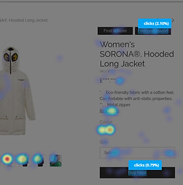
Product Page
Reduced buttons and changed the call to action to make the layout less confusing.
Before
After - Desktop
After - Mobile
Rearranged the information to make it more readable.


Size Chart
Took out the unrelated images and made the layout clearer to make it easier for users to find the right size.
Rearranged the information to make it more readable.
Before
After - Desktop
After - Mobile


Conclusion
The project helped the company learn more about its users, and the role this website plays in their purchasing journey. With the successful drop in bounce rate and the increased time spent on the site, the business took the opportunity to launch more essential features, making the site fully transactional. Now the site is one of the business' biggest sales channels and plays a big part in the business' online presence.