Flight
Booking
process
with Haruko Airways
GOAL
To design a frictionless flight booking process.
MY ROLE
UX UI Designer
UX Researcher
TOOLS
For graphic design, prototyping and wireframing
The project began as a response to the common struggle of booking flights on mobile. The new start-up airline, Haruko Airways were looking to create a mobile app experience that is easy and save the users from confusion and frustration. After researching the current flight booking apps in the market, the product team I was in sensed an opportunity to optimise the journey. The goal of this project was to design a friction-free flight booking process and test it in the market.
As a UX researcher and UX designer in this project, I identified pain points and problems that might occur in the booking process by conducting user testing of some competitor apps with target users.
I analysed the research findings by brainstorming with my product manager partner, mapping out an affinity diagram and creating a user journey map.
Lastly, I design the wireframes and prototypes to test with users, then amended the design based on findings and tested again to find the best solution.
1 Research
Before thinking about solutions for Haruku Airways, I carried out a great deal of research to identify the specific problems in the flight booking process and how other companies were trying to solve it, such as:
-
Competitive benchmarking - to learn how other business addressed the problems.
-
User testing of competitors' apps - to collect and quantify feedback to identify pain points and common user frustrations.

2 Analysis
To help us make sense of the output from the research, my product manager and I created an affinity map and user journey map to analyse how users think, behave and feel during the process as well as the pain points that they encountered.


Based on the research, we identified our most important persona, below, to empathise with the user and to guide us when creating the solutions:
Persona

Tom
Holidaymaker
Needs to accomplish..
Book a trip for himself and others.
Needs to feel..
In control, not confused.
Know the service he is paying for.
Know how much he's paying.
3 The Problem
The main problem in this journey was the complexity and distractions on certain screens such as when showing available flights and selecting flights. Also, understanding the total cost of the flight posed a significant problem and there was a fear of being charged hidden fees.

Why is it so expensive? I might abandon the app before I realised the price is for round trips... it's not clear at all.
What do the stars mean? I can't remember all the abbreviation? So much information, yet so unclear. :(
_edited.jpg)
It's hard to know the total price at this stage, there are a lot of buttons and explanations but I skip them easily.
Are there hidden fees? What is "FLEXI"?How much exactly am I paying? I feel nervous!

My approach to solving the issue was to simplify the options of the process and provide the user with a simpler, more focused and effortless process.
4 Solutions
As the UX designer in the team, I created a series of testable prototypes and wireframes for the flight-booking journey to narrow down to the best possible solution.

Pain points


Solution
• Strong primary CTA to lead the user to start the booking journey right away. Keep secondary CTAs small but accessible.
• Lay out all the stages of the booking process to make the journey is predictable.
Select Destination Screen
Pain points
• Difficult to find airport details when the airport initials are confusing.


Solution
• Be clear about what the initials of airports stand for and populate when selected.
Available Flights Screen
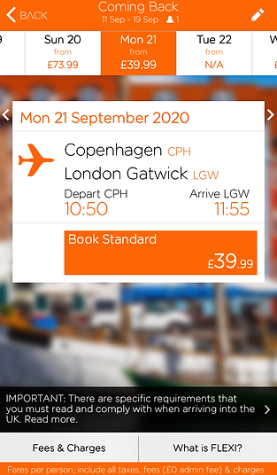
Pain points
• Ratings are confusing.
• The result cards are not tappable.
• Airports are not clear.
• The price shown is for the round trip, looks very expensive and confuses the user.


Solution
• Display the time of the flights and the prices in a way that is easier to read. Avoid putting the numbers too close together.
• Flight detail options to see more about airports and stopovers.
• Populate the flight costs and sub-total to make the user feel secure and confident that there are no hidden fees.
Select Flights
Pain points
• Confusion when confirming the trip - when the flights are chosen, the continue button doesn’t work until clicking on the ’fare condition’ link.
• After selecting the flight, luggage options dropped down, but it’s not clear that you should click on it to continue the journey.


Solution
• Clear and focused flow to lead the user through the journey.
• Clear 'Continue' button and rules to continue the flow.
Home Screen
• Asking too many questions before getting to the actual home (booking) page.
• Difficult to find the Booking tab as the home page has defaulted in another page.
5 Conclusion
The research process informs the team of the current issues and frustrations the users are facing and the fear of hidden fees linked to negative experiences.
The project has been tested several times to validate the solution, the current version has received quite positive feedback from users and developers. Moving forward it is worth thinking about the other use cases in the app and the process has to link/ integrate well with other main use cases that will occur using this app (for example, the check-in process or upgrading the trip).